Home Blog Presentation Ideas Understanding the 10/20/30 Rule of PowerPoint Presentations

Understanding the 10/20/30 Rule of PowerPoint Presentations
Imagine sitting through a seemingly never-ending presentation. The speaker rambled on, reading from text-heavy slides, using a tiny font that strained your eyes, and failing to connect with the audience. As the minutes ticked by, you found yourself daydreaming and eagerly awaiting the end of the ordeal.
If you have been in this situation, then you know what to do if you were in the presenter’s shoes – make your presentations concise. But how do you even start?
You can follow several techniques when preparing your deck and your presentation as a whole. One of them is the 10/20/30 rule of PowerPoint , a presentation rule championed by Guy Kawasaki – a former Apple employee and a marketing specialist.
Table of Contents
What Is the 10/20/30 Rule of PowerPoint Presentations?
Applying guy kawasaki’s 10 slide template in any presentation, the 20 minutes rule, the 30-point font rule, the benefits of using the 10/20/30 rule, tips for applying the 10/20/30 rule to your presentation.
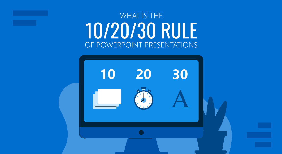
The idea of the 10/20/30 rule is easy to understand, which is summed up in three points.
- Your presentation should consist of no more than 10 slides .
- Your presentation should last no longer than 20 minutes .
- The text on each slide should be no lower than 30 points in size .
Guy Kawasaki’s 10-20-30 rule for slideshows emphasizes brevity, focus, and visual appeal to keep your audience engaged and deliver your message effectively.
Let’s examine each rule and explore how to apply it to your presentations.
The 10 Slides Rule
Kawasaki argues that a typical person can only take 10 concepts in one sitting. Therefore, according to him, a presentation should only consist of 10 slides, each serving a specific purpose and conveying a distinct concept.
This insight underscores the importance of concise, focused presentations that prioritize key messages and avoid overwhelming the audience with too much information.
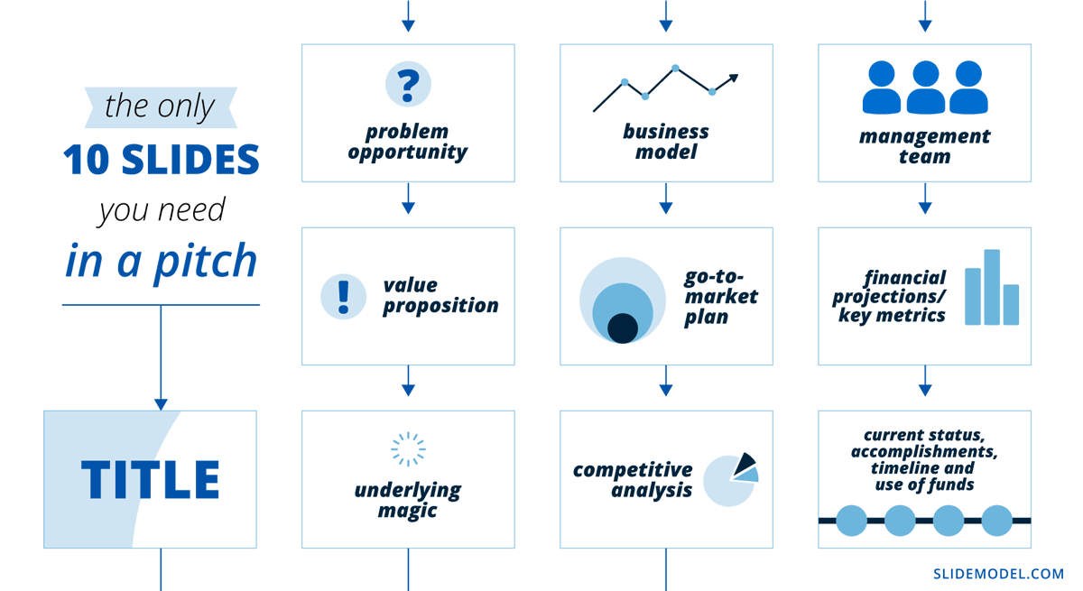
If you are a business presenter struggling to develop a pitch deck , Kawasaki suggests a 10-slide PowerPoint template that includes what venture capitalists like him care about.
- Title – Includes the business name, the presenter’s name, contacts, etc.
- Problem/Opportunity – Highlights pain points or unmet needs of customers you aim to solve.
- Value Proposition – Articulates the value or benefits of your product or service.
- Underlying Magic – Explains the key technology that goes into your product or service offers.
- Business Model – Describes how you plan to generate revenue.
- Go-to-Market Plan – Outlines your strategy for bringing your product or service to market, e.g., marketing and sales plan .
- Competitive Analysis – Explains how your business is positioned to compete and capture market share.
- Management Team – Highlights your management team’s skills, experience, and expertise that will drive the success of your business.
- Financial Projections and Key Metrics – Highlights your business’s financial viability and potential profitability.
- Current Status, Accomplishments to Date, Timeline, and Use of Funds – Provides an overview of your current business status, any accomplishments or milestones achieved to date, the timeline for future milestones, and how you plan to use the funds you seek.
The 10 rule slide was specifically designed for startup and business presentations , focusing on pitching a business idea or concept to potential investors . However, it can also be a useful framework for other types of presentations that don’t deal with selling a service or product.
For example, if you are a lecturer, you can emulate Kawasaki’s PowerPoint template layout and reduce your presentation to 10 slides. Some slides might not be relevant to the nature of your topic, so replace them with one that works for your presentation. Using PPT templates helps you focus on the graphical aspect so you can articulate the content to fit into exactly 10 slides (while preserving the same aesthetic).
Let’s say you are a mindfulness expert talking about the benefits of meditation. The first three slides of Kawazaki’s workflow may be applied as you’ll need to establish your audience’s pain points and your solution.
However, you may need to modify the remaining slides as you’re not seeking to make a sale or raise funding. You may use them instead to discuss the main content of your presentation – in this case, the benefits of meditation. The last two slides may contain your conclusions and call to action, respectively.

Now, off to the second part of the 10/20/30 presentation rule.
According to Kawasaki, you only have 20 minutes to present your 10 slides – the time needed before your audience’s attention starts declining. He believes it is long enough to convey a meaningful message but short enough to maintain the audience’s attention span.
This is exactly why most TED Talks or The Big Bang Theory episodes would only last for approximately 18 minutes.
While giving longer presentations is possible, longer presentations may be more difficult to maintain audience engagement and attention.
Kawasaki’s final rule pertains to the font size that presenters can use. This rule suggests that presenters should use a font size of at least 30 points for all text in their slides , including titles, headings, and body text.
When creating presentations, it is common to jam each slide with text and information. This poses two possible problems:
- First, it may take your audience’s attention from you as they may end up reading your whole presentation and stop listening to you.
- Second, including too much information can make your presentation overwhelming and difficult to follow.
Using a larger font size, you must include only the key points of your presentation slides. This prevents your audience from getting ahead of you and keeps them listening to you speak. By applying this rule, you are also ensuring your content is understandable for people with visual impairments. We highly recommend you check concepts from W3C.org on how to make events accessible, as some of these rules can benefit your audience.
Presenters often ask themselves whether is worth applying a new framework for their presentation design and delivery. The reality is that the 10/20/30 Rule of PowerPoint Presentations is one of the most effective methods to build your presentation skills . In the list below, we expose the main benefits of this framework for presenters.
Concise and Focused Presentation
With a limited number of slides and a strict time limit, the 10/20/30 encourages you to choose the most relevant content and eliminate unnecessary information carefully. This avoids overwhelming your audience with too much information and ensures your key message is clear and memorable.
Improved Audience Engagement
This rule encourages presenters to focus on delivering a clear message rather than overwhelming the audience with flashy visuals. With fewer slides and a shorter duration, you are likelier to hold your audience’s attention throughout the presentation. This also allows you to address questions from the audience, leading to better interaction and a productive meeting.
Increased Chance of Success
Whether pitching to investors or selling a product, a concise and focused presentation can significantly increase your chances of success. The 10/20/30 rule helps you effectively communicate your value proposition and address potential concerns. This makes your presentation more persuasive and memorable, increasing the likelihood of securing funding or closing a sale.
Time Management
The more senior the person you present to, the lesser time you got to make your case and convey your message. Following the 10/20/30 encourages you to be mindful of the time and deliver your presentation within the allocated timeframe. It also allows you to show respect for your audience’s time.
1. Present One Idea Per Slide

Following Kawasaki’s rule on creating your PowerPoint presentation, identify the key points you want to convey to your audience and allocate one slide for each.
Presenting one idea per slide can help your audience stay focused on the topic at hand. It makes it easier for them to understand and remember your message, as it reduces the amount of information they have to process at once. When there’s too much information on a slide, it can be overwhelming and distracting, making it difficult for your audience to stay engaged and attentive.
Presenting one idea per slide can also help you control the flow of information and ensure that you cover all of your main points.
2. Keep Your Slides Simple
As mentioned earlier, the 10/20/30 rule emphasizes simplicity. Keep your slides simple and avoid flashy design elements that may distract your audience.
Use a consistent color scheme , font style, and layout throughout your presentation. This will help your audience follow along and focus on your message.
3. Balance Text and Visuals
Visuals like images, charts, graphs, videos, and diagrams can help break up text-heavy slides and make your presentation more interesting and memorable. However, relying solely on images can also be ineffective and lead to confusion or disengagement.
When using visuals in your slides, it’s important to balance text and images. Text can provide important context and details, while images can help illustrate key points and make your presentation visually appealing.
Let’s say you want to inform your audience of your company’s marketing plan . Using a rising spiral template is an excellent choice since it can represent multiple plan stages with increasing intensity.

4. Break Down Your Presentation into Smaller Units and Make it Interactive
Kawasaki’s 10/20/30 rule only gives you 20 minutes to wrap up the whole presentation, but what if you need more than that?
It’s not uncommon to give presentations that last 45 minutes to an hour – for instance, if you are giving a lecture or facilitating a training workshop for employees. The longer your presentation, however, the harder it will be to hold your audience’s attention.
One great way to keep them engaged is to divide your presentation into smaller units and pause in between.
So, before the guy from the third row starts yawning, plan in-between activities to reenergize your audience and reacquire their attention. It can be a simple Q&A session, interactive exercises, or team-building activities.
Don’t forget to time your activities so they won’t disrupt the flow of your presentation.
5. Start Strong
The opening of your presentation is critical in capturing your audience’s attention and setting the tone for the rest of the presentation. Start with a compelling hook, such as a thought-provoking question, a powerful quote, or an engaging story, to grab your audience’s attention. Clearly state the purpose and objectives of your presentation to establish the context and provide a roadmap for what’s to come.
6. End Strong
Your outro is as important as your introduction. So, instead of ending your presentation with a flat Thank you slide , use the opportunity to nudge your audience to action.
Using a summary slide is one of the ways you can end your presentation if your goal is to reinforce your key points. It can be a useful reference for the audience, helping them remember the most important information.
You can also encourage your audience to take action based on what they’ve learned in your presentation. This can be a great way to motivate them to apply the concepts you’ve covered.
The 10/20/30 rule of PowerPoint is a useful framework to emulate in creating your presentation.
There are questions about the practicality of its application outside the business context. However, we can agree that it teaches us valuable insight – keeping presentations concise as possible. Limiting the number of slides, adhering to a strict time limit, and using a larger font size can create a concise presentation that effectively communicates your message.
There’s no one-size-fits-all approach to presenting; you don’t have to strictly follow Kawasaki’s rule. Depending on the audience and the topic, modify the template and adapt your presentation to suit the situation.
Like this article? Please share
Presentation Approaches, Presentation Skills Filed under Presentation Ideas
Related Articles

Filed under Presentation Ideas • November 19th, 2024

What is the Best Way to Deliver Presentations with Authenticity
Do you feel as if your presentations look dull or robotic? Discover how to bring authenticity to your slides and speech with this guide.

Filed under Presentation Ideas • October 31st, 2024
8 Top Reasons Your Presentation Isn’t Resonating and How to Fix It
Don’t feel frustrated about why your presentation isn’t performing as expected. Take a look at this guide to find the answers.

Filed under Business • October 31st, 2024
How to Create a Construction Proposal Presentation
Learn how to create winning construction proposal presentations with clear visuals, detailed information, and structured insights.
Leave a Reply
The 10 Slides, 20 Minutes and 30 Point Font Rule for Presentations
- By Judhajit Sen
- May 14, 2024
What separates a good presentation from a dreadful one? Picture this: a never-ending talk that drones on for over 30 minutes, bombarding you with slide after slide, each crammed with tiny text. By the time the speaker finishes, most of the audience is either sleeping, scrolling through their phones, or daydreaming. What went wrong? And more importantly, how can you avoid such a fate in your PowerPoint presentations? Enter the 10-20-30 Rule, your savior from presentation purgatory.
Presentations are everywhere – in school, work, and even casual settings like PowerPoint parties. But crafting a compelling one requires careful consideration. You must choose a topic that resonates, organize your content logically, design visually appealing slides, adhere to a reasonable time limit, and master your delivery style. It’s not just about sharing information; it’s also about engaging the audience .
Guy Kawasaki, a former Apple employee and marketing guru, champions a simple yet powerful principle: the 10-20-30 Rule of PowerPoint. This rule advocates for brevity, recommending no more than ten slides, a maximum duration of 20 minutes, and a font size of 30 points minimum. It’s a game-changer in presentations, emphasizing clarity, conciseness, and connection with your audience.
In an era where effective communication reigns supreme, mastering the art of presentations is essential for success. Guy Kawasaki’s 10-20-30 Rule offers a beacon of guidance, reshaping how we approach and deliver business plan and marketing presentations. So, let’s dive in and discover its transformative power together.
Key Takeaways
- Brevity is Key: Guy Kawasaki’s 10-20-30 Rule stresses brevity in presentations, limiting slides to 10, duration to 20 minutes, and font size to 30 points. This ensures the concise delivery of essential information without overwhelming the audience.
- Optimize Engagement: By adhering to the rule, presenters can optimize audience engagement . Shorter presentations and larger font sizes maintain audience attention, leading to better retention of key points and increased comprehension.
- Versatile Application: While initially designed for business pitches, the 10-20-30 Rule is adaptable across various contexts. Teachers, students, and professionals from any field can leverage its principles to craft compelling presentations that resonate with their audience.
- Simplicity Matters: Simplifying presentations using Kawasaki’s rule allows presenters to focus on delivering impactful messages. By emphasizing clarity and conciseness, presenters can make a lasting impression regardless of the presentation’s objective.
Defining The 10-20-30 Rule
The 10-20-30 Rule is a simple yet powerful guide for crafting effective presentations. Coined by Guy Kawasaki, a renowned figure in Silicon Valley, this presentation outline rule emphasizes brevity, clarity, and visual impact to captivate your audience and convey your message efficiently.
Guy Kawasaki, drawing from his experience as a venture capitalist, observed the essence of a successful presentation and distilled it into three key components:
1. Conciseness: Limit your presentation to just ten slides.
2. Time Management: Keep your presentation within a 20-minute timeframe.
3. Readability: Ensure that the font size on each slide is at least 30 points.
This rule isn’t just about numbers; it’s about optimizing your presentation’s impact. Adhering to these guidelines can create engaging and memorable presentations that resonate with your audience. Whether you pitch a business idea or deliver a report, the 10-20-30 Rule serves as a blueprint for success, enabling you to deliver your message effectively and leave a lasting impression.
Let us go through the three key components of the 10-20-30 Rule in detail.
The 10-Slide Rule

When crafting a winning presentation, Guy Kawasaki’s 10-20-30 Rule sets a clear path for success, with the 10-slide rule as a cornerstone principle. Kawasaki’s insights into the human mind’s capacity to absorb information underscore the importance of brevity and clarity in presentations.
1. Title Slide: The journey begins with a compelling title slide introducing your presentation, featuring essential information such as your name, company details, and contact information.
2. Problem/Opportunity: The second slide delves into the heart of the matter, outlining the problem or opportunity your product or service addresses. This is your chance to spotlight the pain points or unmet needs of your target audience.
3. Value Proposition: Slide three is dedicated to showcasing your offering’s unique value proposition. Showcase the benefits your product or service offers, emphasizing why it stands out in the market.
4. Underlying Magic: On the fourth slide, unveil the magic behind your product or service—the innovative technology or approach that sets you apart from the competition. Keep it concise yet impactful.
5. Business Model: Slide five zooms in on your business model, elucidating how you plan to generate revenue and sustain profitability. This is your opportunity to demonstrate the viability of your venture to potential investors or stakeholders.
6. Go-to-Market Plan: The sixth slide outlines your strategy for bringing your product or service to market. From marketing initiatives to sales tactics, provide a roadmap for achieving your business goals.
7. Competitive Analysis: Slide seven offers insights into your competitive landscape. Analyze rival offerings, sales processes, and marketing strategies, highlighting how your approach positions you for success.
8. Management Team: The eighth slide spotlights your management team, showcasing their expertise, experience, and contributions to your venture’s success. Investors want to know they’re backing a capable and skilled team.
9. Financial Projections and Key Metrics: Slide nine presents a snapshot of your business’s financial outlook, featuring projections, key metrics, and budget plans. This is crucial for demonstrating the potential return on investment.
10. Current Status and Use of Funds: Finally, the tenth slide wraps up your presentation by providing an overview of your current status, accomplishments to date, timeline for future milestones, and how you plan to allocate the funds you seek. It’s your opportunity to leave a lasting impression with a strong call to action .
By adhering to Kawasaki’s 10 concepts rule, presenters can streamline their message, captivate their audience, and effectively drive home their key points. Whether pitching to investors, presenting to stakeholders, or sharing insights with colleagues, this rule is a guiding beacon for impactful presentations.
The 20-Minute Rule

Guy Kawasaki’s 10-20-30 Rule for presentations doesn’t just focus on the number of slides or font size; it also emphasizes the importance of time management, particularly the 20-minute rule. According to Kawasaki, speakers should end a presentation within 20 minutes, as audience attention tends to wane beyond this timeframe.
1. Attention Span: With human attention spans dwindling, Kawasaki stresses the need to keep presentations concise, avoiding fatigue or disengagement from the audience. This rule aligns with research indicating that people tune out after about 10 minutes, making a 20-minute duration optimal to engage your audience .
2. TED Talks Model: The effectiveness of the 20-minute rule is mirrored in popular public speaking formats like TED Talks, where speakers deliver impactful messages within this timeframe. These fast-paced, engaging, and memorable talks prove that brevity doesn’t compromise substance.
3. Structuring Your Talk: Adhering to the 20-minute limit simplifies the planning and structuring process. Presenters can effectively allocate time to each slide or critical point, ensuring all essential information is covered within the allotted timeframe.
4. Audience Engagement: Longer presentations risk losing audience interest and focus. By keeping presentations under 20 minutes, presenters increase the likelihood of audience retention and comprehension.
5. Flexible Time Slots: While presentations may be scheduled for longer durations, sticking to the 20-minute rule allows for flexibility. It leaves ample time for questions, discussions, and unforeseen technical issues, ensuring a smooth and efficient presentation experience.
6. Practical Considerations: Kawasaki acknowledges real-world challenges, such as technical setup time or late arrivals, emphasizing the importance of delivering a succinct pitch within the designated timeframe.
7. Structured Approach: A well-structured 20-minute presentation typically includes a brief introduction, problem statement or question, main body of critical points, and a concise conclusion. This format maximizes impact while respecting audience attention spans.
Adhering to the 20-minute rule enhances presentation effectiveness, keeping audiences engaged and ensuring key messages resonate effectively within a limited timeframe.
The 30-Point Font Rule

Guy Kawasaki’s 10-20-30 Rule emphasizes not just the content of presentations but also their readability, especially with the 30-point font rule. Keeping font sizes at a minimum of 30 points ensures clarity and prevents overcrowding on slides, thus enhancing audience engagement.
1. Clarity Overload: Small fonts on slides can distract and overwhelm audiences, drawing attention away from the presenter. Kawasaki stresses the importance of legibility in focusing on critical points and preventing audiences from reading ahead and disengaging.
2. Key Point Focus: Presenters must distill their content to essential points by enforcing a minimum 30-point font size. This practice prevents information overload and ensures audiences remain attentive and receptive to the speaker’s message.
3. Accessibility Consideration: Larger font sizes benefit individuals with visual impairments, ensuring presentation inclusivity. Kawasaki’s rule aligns with accessibility guidelines, making presentations accessible to a broader audience.
4. Strategic Content Selection: Adhering to the 30-point font rule prompts presenters to prioritize content, selecting only the most critical information for inclusion. This selective approach enhances audience comprehension and retention.
5. Visual Clarity: Larger fonts enhance slide legibility, reducing strain on the audience’s eyes and encouraging active engagement. This approach fosters a smoother presentation flow and facilitates audience understanding.
6. Content Quality: Limiting font size to 30 points or above forces presenters to focus on conveying key messages effectively. This requirement encourages deeper understanding and more impactful content delivery.
7. Engagement Optimization: Font sizes of 30 points or higher keep audiences focused on the speaker rather than struggling to decipher small text. This fosters a more engaging and immersive presentation experience, maximizing audience retention and comprehension.
Adhering to Kawasaki’s 30-point font rule ensures that presentations are clear, concise, and accessible to all audience members. By prioritizing readability and content focus, presenters can deliver more impactful presentations that resonate with their audiences.
Applying The 10-20-30 Rule Beyond VC Presentations
Entrepreneur Guy Kawasaki devised the 10-20-30 Rule drawing from his venture expertise. While initially crafted for business pitches, its adaptability extends beyond the startup world. It’s a winning formula for anyone seeking to sway opinions, whether you’re pitching a product, securing funding, or simply conveying ideas.
The essence of the rule lies in simplicity and clarity. Limit your presentation to 10 slides, each delivered in 20 minutes, with a font size of no less than 30 points. This structure ensures focus, conciseness, and audience engagement.
This approach isn’t exclusive to business endeavors. Teachers, students, or professionals from any field can benefit. Suppose you’re a teacher discussing mindfulness in class. Embrace Kawasaki’s methodology by condensing your lecture into ten slides. While the initial slides might address your audience’s needs and your proposed solution, the subsequent ones should delve into the benefits of meditation. The final slides could encapsulate key takeaways and urge action tailored to your audience’s needs.
Moreover, leveraging PowerPoint templates streamlines the process, allowing you to concentrate on content delivery. Adhering to the 10-20-30 principle ensures your message remains focused and impactful, regardless of your presentation’s objective.
Wrap-Up: The 10 slides, 20 minutes and 30 Point Font Rule for Presentations
In the world of presentations, the 10-20-30 Rule is a beacon of guidance for marketers and presenters alike. Simplified for success, this rule packs a punch with its straightforward approach: 10 slides, 20 minutes, and a font size of 30 points. You’re poised to make a lasting impact by condensing your content into these parameters when you make your presentation.
First, limiting yourself to 10 slides forces you to distill your message to its core, highlighting only the most crucial points. This ensures that your audience stays focused on what truly matters.
The 20-minute timeframe keeps you on track and encourages you to deliver your message concisely and effectively. There is no room for rambling or unnecessary details here; every minute counts.
Lastly, the 30-point font size is a visual cue, reminding you to keep your slides clean and concise. Large fonts discourage cluttered slides and encourage you to focus on key takeaways, not wordy explanations.
Remember, while the 10-20-30 Rule may have its roots in marketing, its principles can be applied across various contexts. Whether you’re a student, entrepreneur, or professional, mastering this rule equips you with the tools to engage your audience and drive your point home with clarity and impact.
Frequently Asked Questions (FAQs)
1. What is the 10-20-30 Rule for presentations?
The 10-20-30 Rule, popularized by Guy Kawasaki, is a guideline for crafting impactful presentations. It suggests limiting your presentation to 10 slides, keeping it within 20 minutes, and using a font size of at least 30 points. This rule aims to ensure brevity, clarity, and audience engagement.
2. Why is the 10-20-30 Rule important?
The rule emphasizes concise communication, respecting audience attention spans, and enhancing readability. By following this guideline, presenters can deliver focused, memorable presentations that effectively convey their message and captivate their audience.
3. How can I apply the 10-20-30 Rule to my presentations?
To apply the rule:
(a) Start by selecting essential points and condensing them into ten slides.
(b) Aim to deliver your presentation within a 20-minute timeframe, focusing on clarity and avoiding unnecessary details.
(c) Ensure your slides have a minimum font size of 30 points for optimal readability.
4. Can the 10-20-30 Rule be adapted for different types of presentations?
The rule’s principles can be adapted for various presentation contexts, including business pitches, academic lectures, or casual talks. Whether pitching a product, delivering a report, or teaching a class, adhering to the 10-20-30 Rule can help you streamline your message and engage your audience effectively.
Master Stellar Presentations with Prezentium’s 10-20-30 Rule Implementation
Transform your presentations with Prezentium ‘s expert services tailored to Guy Kawasaki’s 10-20-30 Rule. Say goodbye to long, tedious presentations that leave your audience snoozing or scrolling through their phones. Our overnight presentation service ensures you receive a stellar, concise presentation in your inbox by the next business day, adhering to Kawasaki’s guidelines for brevity and clarity.
Our team of presentation specialists will help you craft engaging slides, transforming your ideas into exquisite presentation designs while following the 10-slide rule. Whether you pitch a business idea or deliver a report, our experts will ensure your message is conveyed effectively within 20 minutes, keeping your audience engaged and focused.
Additionally, our Zenith Learning workshops combine structured problem-solving with visual storytelling, empowering you to master the art of presentations using the 10-20-30 Rule. Join us in reshaping how you approach presentations and leave a lasting impression on your audience. Let Prezentium be your partner in crafting captivating presentations that resonate with clarity and impact.
Why wait? Avail a complimentary 1-on-1 session with our presentation expert. See how other enterprise leaders are creating impactful presentations with us.
Overcoming Common Communication Challenges in the Workplace
Two-way communication: two way communication and two-way conversation best practices, nvc or nonviolent communication: non violent “language of life”.

IMAGES
VIDEO